Behind the design: the tie dye & ombre collection
Kate Butler, Head of Design from our Home & Gift Team, takes us through the development of the products and explains how traditional dyeing techniques were combined with digitised printing to create the latest uplifting collection of colourful homeware to hit the OB shelves.
The inspiration
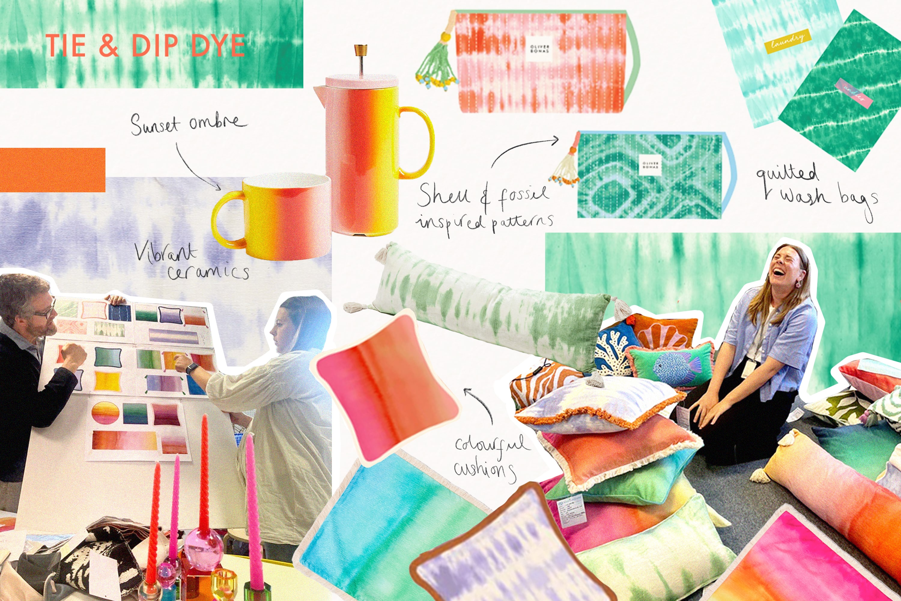
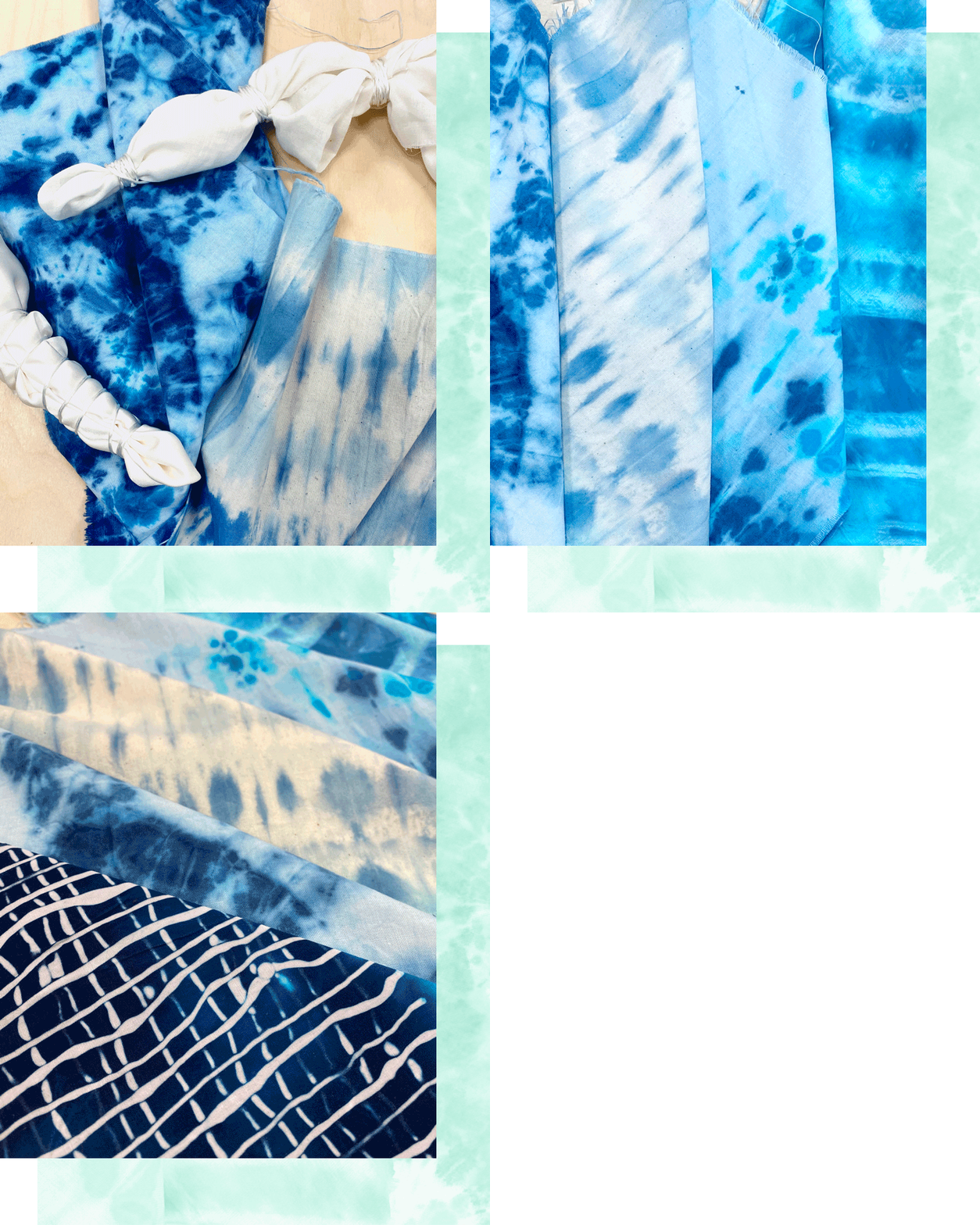
‘This season we've been inspired by patterns found in nature,’ explains Kate, ‘and we’ve found that the use of tie dye and ombre mirrors natural effects – think ombre sunsets and tie dye finishes that resemble shell or fossil patterns or a leaf under a microscope.’
The team liked the fact that with traditional tie-dye techniques the pattern is hard to control and results in something unique and unexpected. ‘We're lucky that our talented suppliers are able to interpret these very handcrafted methods to create something special,’ says Kate.
The process
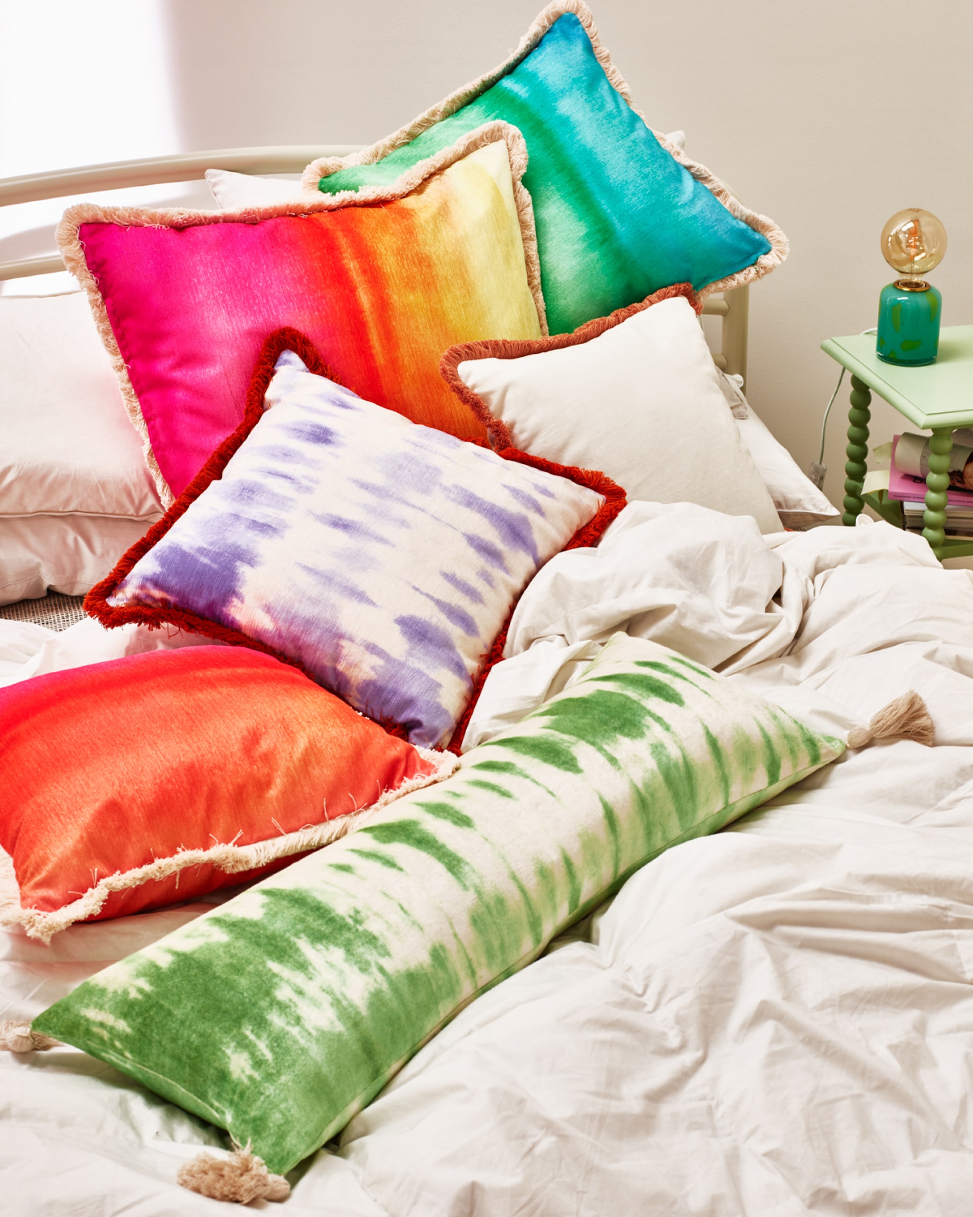
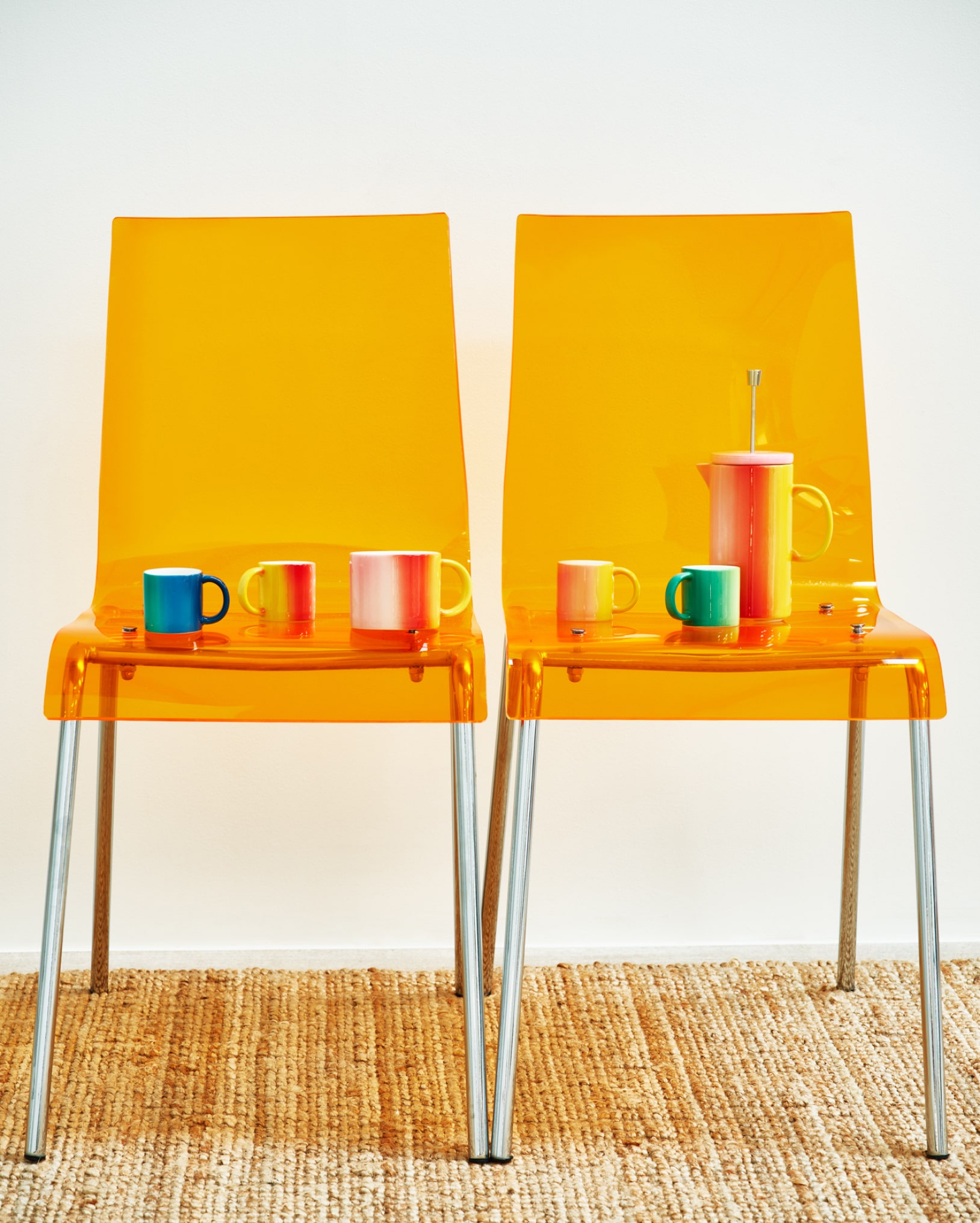
The team created some tie-dye print by hand using the traditional method of string and ink, which was then worked on in Photoshop to create a pattern that could then be printed onto the products. ‘For the ombre technique we dipped paper into ink to create the bleed effect,’ says Kate, ‘then we manipulated the pattern digitally to make it work on a variety of products and to perfect the colours and gradient of the ombre.’
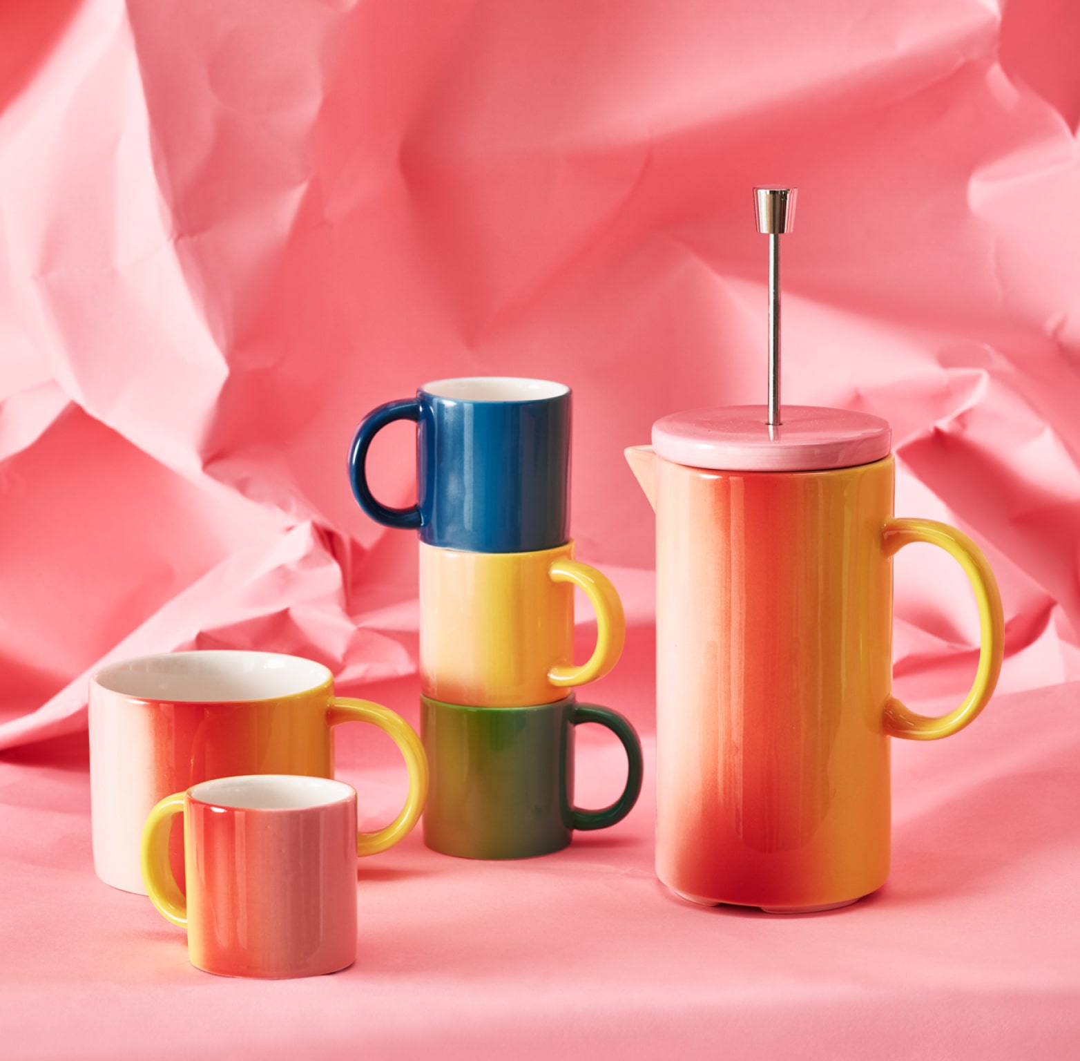
‘I really like the tie-dye on the wash bags, which are printed and quilted by hand using traditional techniques,’ says Kate. ‘But it’s the ombre cushions that I think are the hero of the collection. The gradient effect is printed on high-quality chenille fabric, giving them a slight lustre that makes them feel like a real luxury item.’
‘We used the prints across a range of materials from textiles to ceramics, and the results were really varied and different to anything we’ve done before,’ she says. ‘In store, the products look exciting and unexpected, and that's what we are all about.’

